mike bell maps tube map designing

You Got Map Software That Does It for You?

Why Map Software Can't Replace a Creative Mind

People often ask me, “Is there a bit of software that automatically creates these maps?” If I had a pound for every time I’ve heard that, I’d probably be on a beach somewhere.

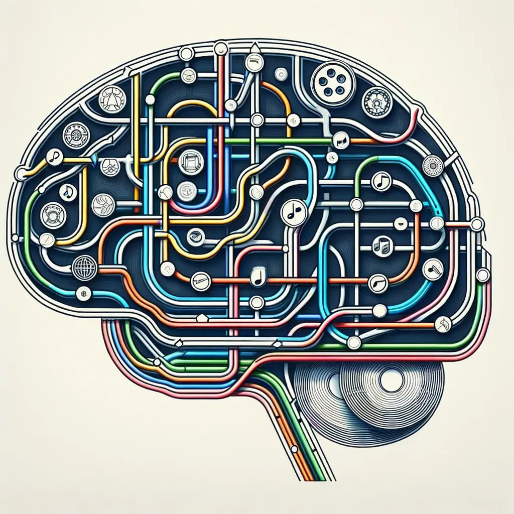
The truth is, there’s no button you can press to generate one of my music maps. Software can’t do it—because it’s not just data. Every map I design is the result of deep research, structured manually, and crafted with artistic care. These aren’t automated diagrams. They’re visual histories, built by hand.

Deep Research Without Map Software

Gathering Detailed Discographies

Before any design work begins, I spend weeks compiling detailed discography data. That means going beyond what's readily available online. I use:

  • Liner notes and album credits (excellent sources, though often incomplete)
  • Official band discographies for cross-checking information
  • Interviews, biographies, and fan sites full of rare insights
  • Historical music encyclopaedias and archives, especially for older artists

There’s no single source that holds all the answers. And that’s precisely why automated tools fall short—they can’t piece together scattered, inconsistent information.

Complex Lineups and Changing Musicians

Some bands, like The Beatles, are pretty straightforward. Others, such as Fleetwood Mac, King Crimson, or Frank Zappa, are a tangle of lineup changes and guest appearances. Just figuring out who played what on which album can take days.

I build spreadsheets, cross-reference sources, and dig into each release. This type of work is beyond the capabilities of standard mapping software.

Turning Music Data into Visual Maps

From Raw Data to a Designed Map

Once the data’s gathered, the next job is to translate it into something visual. That’s where the real thinking begins:

  • Each studio album becomes a “station”, marking a key moment in the band’s history
  • Each musician becomes a “line” running through the albums they played on
  • Guest artists or short-term members appear as “interchanges,” showing connections

There’s no automatic way to do this. Every decision—what to show, what to simplify, how to structure it—is made by me, not by a computer.

Why Map Software Falls Short

It’s tempting to think software could take over this process. But there are a few reasons why it can’t:

  • Music history isn’t linear. It’s messy, nuanced and full of odd exceptions.
  • Not all musicians are equal—some are core members, others appear once or twice.
  • Good design needs human judgement. It’s not just lines and dots—it’s a story.
  • Each band is different. No single template fits all.

Designing the Map: More Than Drawing Lines

Building a Visual Layout

Once I’ve structured the data, it’s time to design the map. That means:

  • Choosing colours to distinguish artists, eras or album cycles
  • Positioning stations and adjusting lines to keep them readable
  • Resolving overlaps and intersections without losing clarity

This part blends artistic instinct with technical control. It's not just decoration—it's the heart of making it legible and engaging.

Refining the Details

Design isn’t fast. I spend hours:

  • Tweaking labels and spacing to avoid clutter
  • Checking every name, date and line for accuracy
  • Ensuring the final layout feels balanced and clean

No app can do that kind of refinement. It relies entirely on human effort, judgment, and care.

Bringing It to Life in Print

High-Quality Production

When the design is finished, I move on to print production. That means:

  • Using thick, museum-grade art paper for sharp results
  • Running detailed checks to ensure nothing’s missing or misaligned

The final print isn’t just a data visual—it’s a celebration of the music, made to last and display proudly.

More Than Just Data

These maps aren’t just infographics; they tell the story of a band’s evolution—the musicians who shaped the sound, the albums that marked key milestones, and the hidden connections that fans love to trace.

Leave a comment

Please note, comments need to be approved before they are published.

This site is protected by hCaptcha and the hCaptcha Privacy Policy and Terms of Service apply.

ABOUT MIKE BELL - TUBE MAP DESIGNER

Mike Bell Maps is my growing collection of tube map art prints that reimagine music, movies, and history through the visual language of underground maps.

Each detailed design presents albums in order, film plots, and complex creative histories as clear, engaging tube-style timelines created for fans who value depth and research in their favourite subjects.

RESEARCH-LED DESIGN

Every artwork is built on original research and careful verification. Albums become stations. Musicians, characters, and ideas form connecting lines. This approach turns detailed information into visual storytelling, creating art prints that bring clarity and meaning to subjects people already care about.

George Harrison unique art print gift for fans: Mike Bell transit map style of albums and musicians.

MY STORY

My background is rooted in live sound and large-scale show design, working across music and cultural events for many years. That experience shaped how I understand collaboration, creative evolution, and structure. During lockdown, I applied that knowledge to mapping music and films, developing underground maps that balance accuracy, design, and narrative.

THE ARTWORK

Each print is produced to archival standards and designed to last. These are not novelty posters. They are considered art prints created for people who value music history, film structure, and informed design. They make thoughtful gifts for fans who want something personal, researched, and meaningful.

The Shining film plot lines and character tube map art print, showing every scene as a station and every character as a tube line.

Mike Bell Maps is where research-led tube maps become art prints, and where stories worth knowing are mapped clearly, carefully, and beautifully.

FREQUENTLY ASKED QUESTIONS

Q: What are Mike Bell’s tube map art prints?

A: My prints utilise an advanced visual language based on the logic of underground maps to organise complex histories. By moving beyond basic cartography, I transform albums into "stations" and musicians or themes into "connecting lines." This allows fans to explore hundreds of data points - from session musician credits to chronological collaborations - within a single, intuitive visual system.

Q: How do these maps differ from standard music or tube posters?

A: The primary difference is information density and quality. While standard posters are often low-resolution decorative pieces on thin paper (135-170gsm), my prints are research-led discographies printed on archival-grade, 305gsm+ heavyweight giclée paper. They are designed to be "read" like a book, rewarding deep curiosity with discoveries not found in mass-produced merchandise.

Q: How is the accuracy of the research verified?

A: Accuracy is the core of my design process. Every map is synthesised from primary sources, including official liner notes, session archives, musician interviews, and verified fan databases. By incorporating musician inputs and fact-checking against trusted archives, I ensure that each map is a historically accurate record of the subject’s career.

Q: What subjects are available in the collection?

A: The collection spans a wide range of cultural histories, including music discographies, film plots, politics, and Formula One. Each map focuses on a single narrative, presenting the whole "story" of a subject - such as the evolution of a band or the timeline of a sport- in a clear, high-density visual format.

Q: Are these prints produced sustainably?

A: Yes. I prioritise a carbon-neutral workflow by producing prints locally to the buyer to reduce the shipping footprint. I use sustainable wood frames and archival materials designed for 100+ years of colour stability, ensuring the art is a lasting investment rather than disposable décor.

Q: Why do these maps make the best gifts for music and film fans?

A: Unlike generic posters, these are bespoke cultural maps that celebrate a fan's deep knowledge. Because they are research-led and visually unique (featuring narratives not seen elsewhere), they offer a sophisticated, gallery-quality alternative for those who value the "deep dive" into their favourite artist or film.