


DIRTY DANCING Art Print | Tube Map
- Regular price
-
£105.00 GBP
Couldn't load pickup availability
SHIPPING INFO
- No EU / USA import duties
- Fulfilled Locally in the UK, USA, and EU
- Carbon Neutral Art prints produced locally by the Printspace
- FREE UK, US & EU Tracked Delivery (Royal Mail IN UK)
- Printed, mounted, framed & packed in 4-5 business days
- Then ships 3-7 business days - tracked for your assurance.
- Estimated delivery dates are on a best endeavours basis
- All the above schedules are subject to workloads at PrintSpace London, Düsseldorf, and Brooklyn branches - allow for seasonal timings.
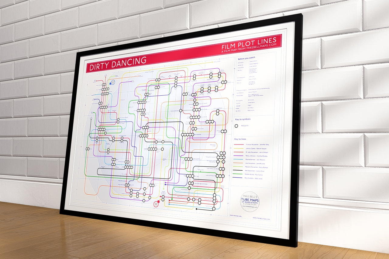
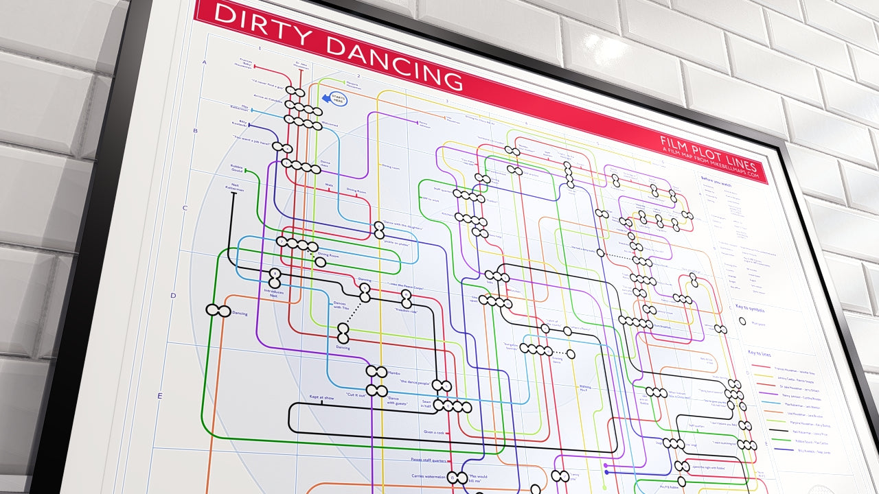
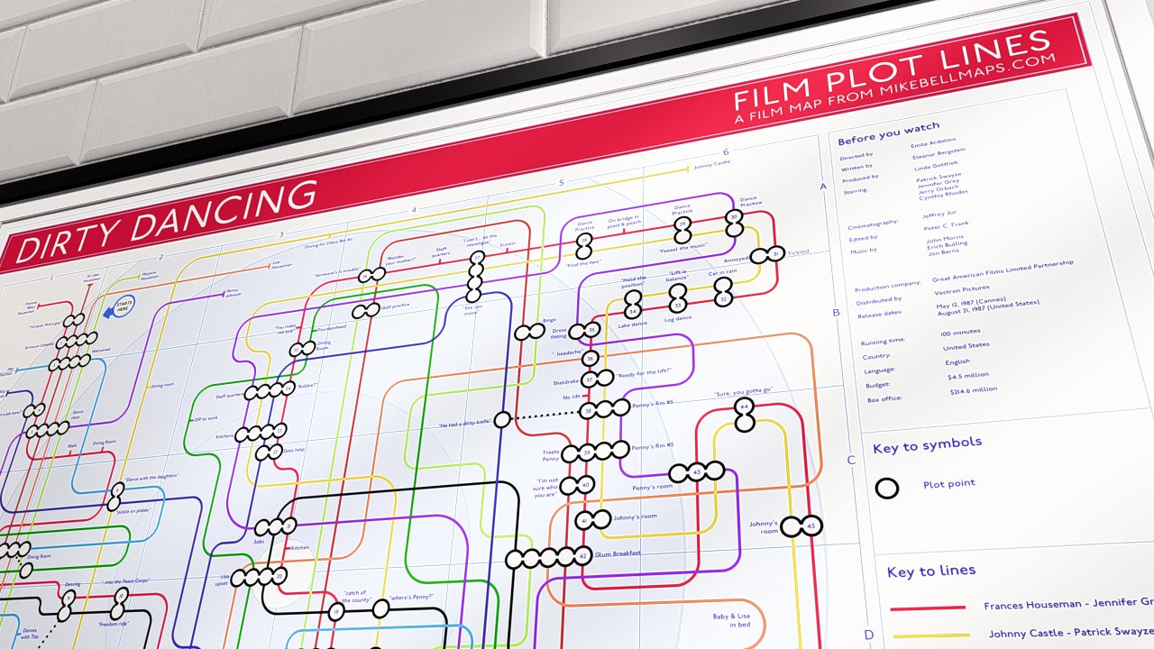
Dirty Dancing Movie Plot Art Print.
Every key plot point and every character arc. The perfect Dirty Dancing plot lines gift for fans of this iconic classic. Step back into the summer of '63.
This visual artwork reimagines the film as a mapped journey, where each significant plot moment becomes a clearly defined station, and every character’s story is shown as a connecting tube line.
Each plot point appears as its own station, guiding you from Baby’s arrival at Kellerman’s through to the triumphant final dance. Central characters, including Baby, Johnny, Penny, and the Kellerman family, are represented as flowing lines that cross and reconnect, showing how relationships develop and drive the story forward.
Dirty Dancing Movie Plot Art Print Map Highlights
- Complete film narrative following the story from Baby’s first steps into the world of dance to the unforgettable closing performance.
- Character pathways that show how Baby, Johnny, Penny, and supporting characters move through the story and shape its emotional arc.
- Key story moments, including the watermelon scene, rehearsal sequences, Penny’s challenges, and the iconic final lift, are all mapped clearly in one cohesive design.
A Must-Have Dirty Dancing Movie Art Print Gift
Whether you have loved this film for decades or are discovering it for the first time, this artwork offers a distinctive and engaging way to experience Dirty Dancing in a single view. Ideal for home display or as a thoughtful gift, it celebrates the romance, music, and lasting cultural impact of one of cinema’s most beloved films.

Tube Map Print Accuracy & Updates
Every one of my prints is the result of my detailed research, cross-referencing, and design refinement. Each tube map is handcrafted to present the most accurate possible picture of an artist’s recording history, a film’s storyline, or a cultural timeline.
I take pride in the precision behind every connection, date, and credit featured across the collection.
Meticulous Research, Human Process
My research combines album liner notes, musicians' inputs, session archives, fan databases, interviews, and verified public sources to ensure each map is factually sound. However, even the most carefully researched projects can contain minor errors or omissions, especially when dealing with complex discographies and multi-decade histories.
Community Feedback & Collaboration
I actively welcome feedback from fans, collectors, and artists who spot inconsistencies or have new information to share. Each correction helps refine future editions and strengthens the historical accuracy of the maps. Contributors who provide verified updates receive discounts on future orders as a thank-you for their diligence and support.
Commitment to Quality
Accuracy isn’t just a promise, it’s part of the creative process. Every update and reprint reflects a commitment to truth, design integrity, and respect for the music, movie, and other stories represented.
I value the relationship with my customers and the collaboration that ensures these works continue to evolve and stay relevant.
I will always strive to combine artistic expression with documentary accuracy, celebrating creativity through precision and openness.
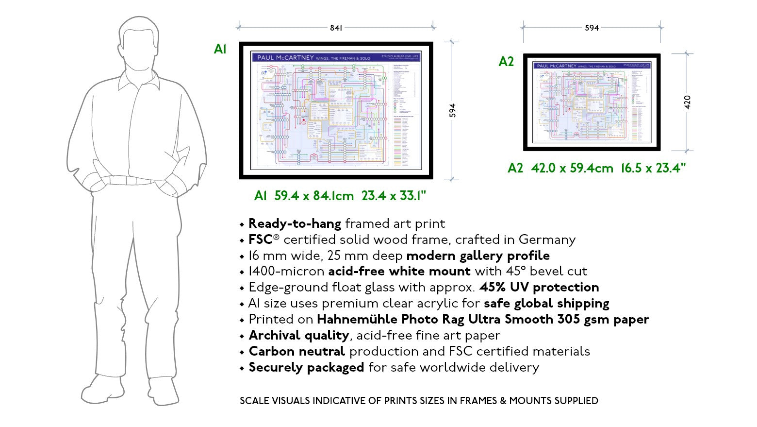
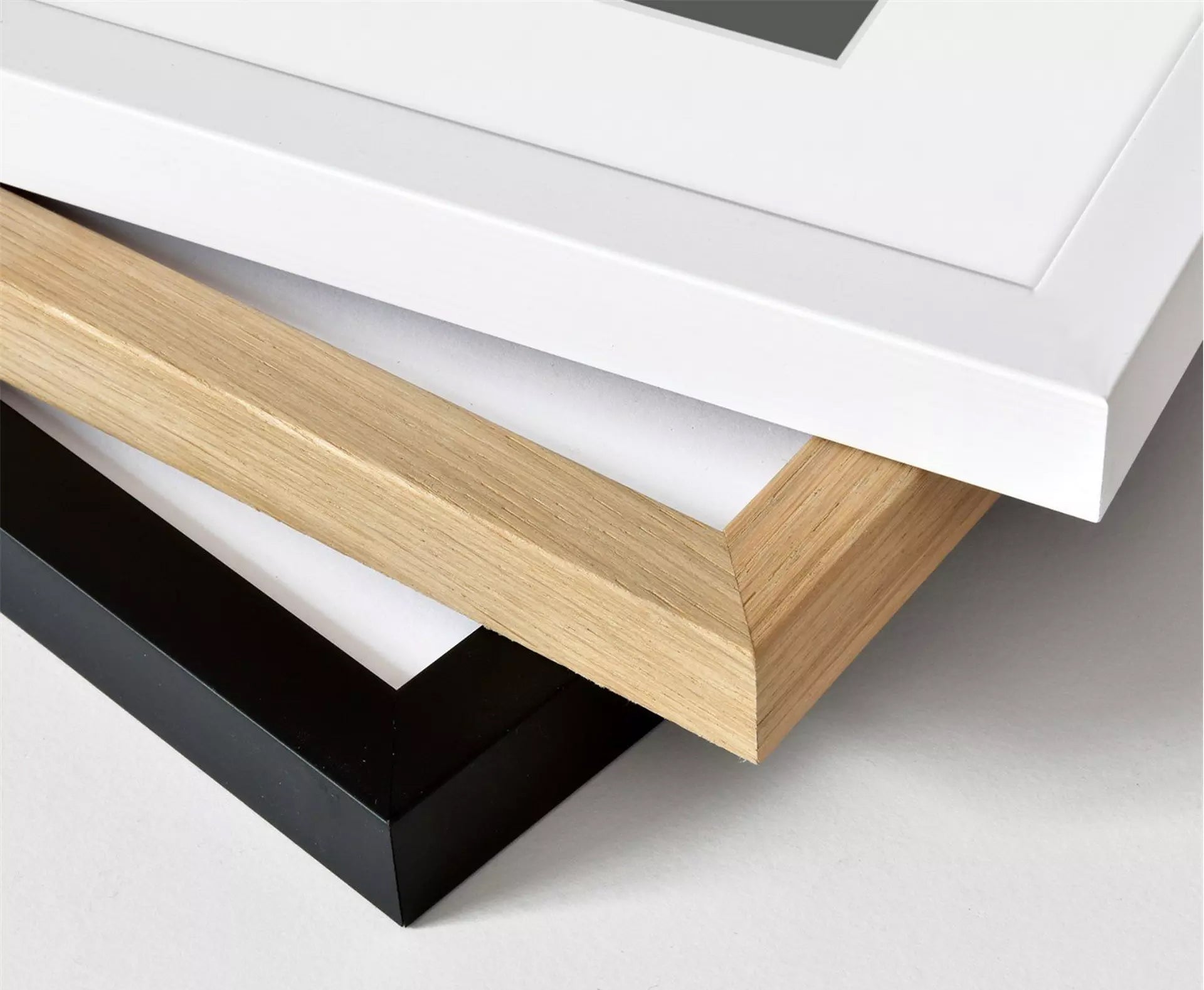
• Ready-to-hang framed art prints
• FSC® certified solid wood frames, crafted in Germany
• 16 mm wide, 25 mm deep modern gallery profile
• 1400-micron acid-free white mount with 45° bevel cut
• Edge-ground float glass with approx. 45% UV protection
• A1 size uses premium clear acrylic for safe global shipping
• Printed on Hahnemühle Photo Rag Ultra Smooth 305 gsm paper
• Archival quality, acid-free fine art paper
• Carbon-neutral production and FSC certified materials
• Securely packaged for safe worldwide delivery
PRESERVING YOUR INVESTMENT - Premium Tube Maps Care Guide
Thank you for choosing a Mike Bell Maps Giclee Print. To ensure your artwork remains as vibrant as the day it was printed for the next century, please follow these professional handling guidelines:
1. The "Clean Hands" Rule - Giclee prints are created with archival pigment inks that sit on the surface of the 305 gsm paper. Natural skin oils can transfer to the ink. We recommend washing and drying your hands thoroughly before handling or wearing white cotton "archival" gloves if available.
2. Avoid the "Roll-Back" - If your print arrived in a tube, let it flatten naturally. Lay it on a clean, flat surface and place a few heavy, smooth objects (like books) on the corners. Never roll the print tightly in the opposite direction, as this can "stress" the heavy paper fibres and cause creasing.
3. Framing is Protection - To ensure the 100+ year lightfastness guarantee, we recommend framing your print behind UV-protective glass or acrylic. Always use acid-free mounting materials (like the mounts provided in our framed options) to prevent "paper burn" or yellowing over time.
4. Location Matters - While our inks are gallery-standard, prolonged exposure to direct, harsh sunlight can eventually affect any pigment. For maximum longevity, hang your map in a location that avoids consistent direct afternoon sun and high-humidity environments (like bathrooms).
5. Dusting - If your print is unframed, never use water or cleaning sprays. A soft, dry microfiber cloth or a clean squirrel-hair brush is all that is needed to remove surface dust.