EVERY MUSIC MAP | EVERY FILM MAP
BREXIT 'BENEFITS' - Politics Maps
Verfügbarkeit für Abholungen konnte nicht geladen werden
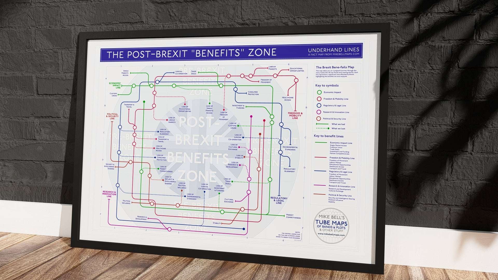
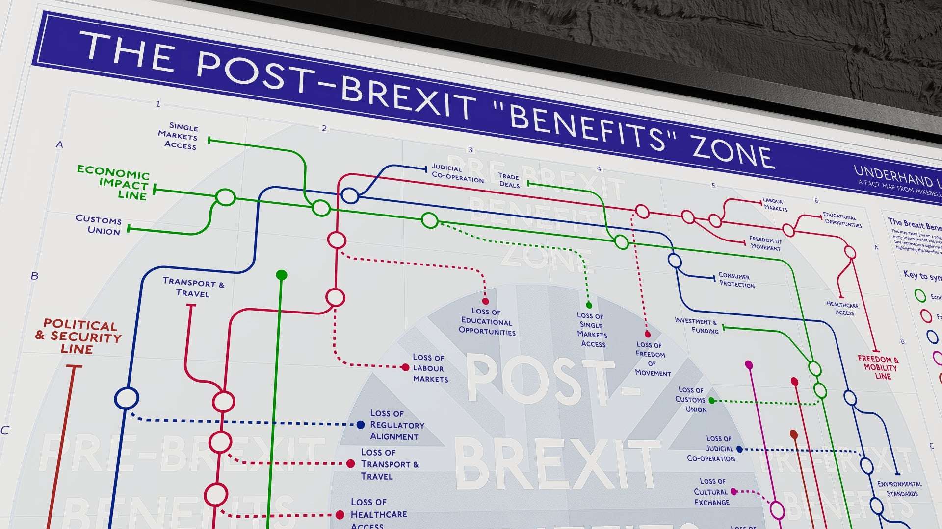
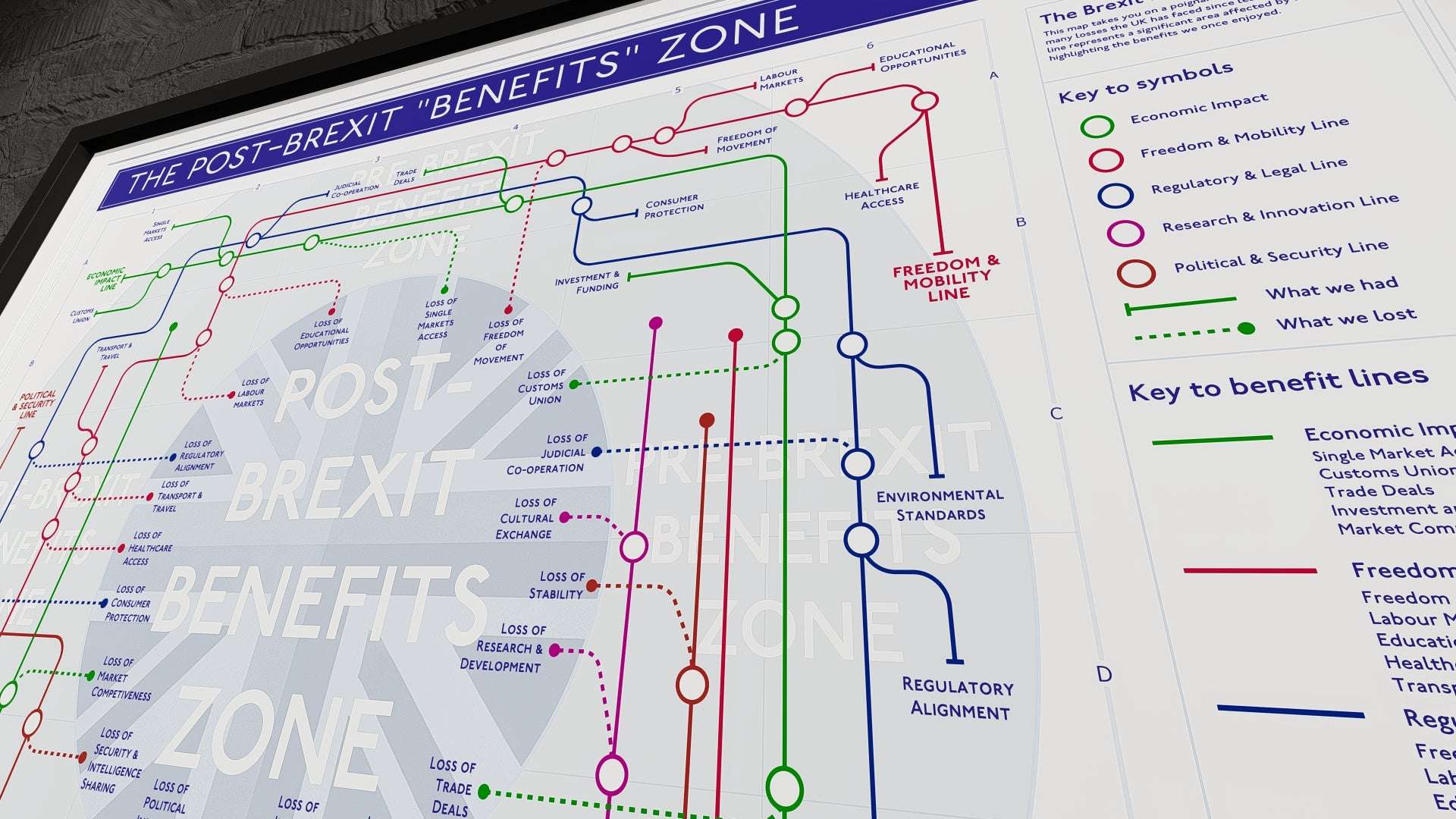
The Brexit Consequences and Economic Impact Tube Map – What Was Lost
Discover the Brexit Consequences and Long Term Consequences Tube Map, a visually engaging way to explore the challenges and disruptions caused by the UK's departure from the European Union. This tube-style map simplifies complex political and economic issues, making it easier to understand the real cost of Brexit across multiple sectors of British society.
A Visual Guide to Brexit’s Impact
The Brexit Consequences and Long Term Consequences Tube Map highlights:
- Economic disruptions – Increased trade barriers, rising inflation, and business struggles.
- Freedom of movement restrictions – Stricter travel, work, and residency rules across Europe.
- Education setbacks – The loss of Erasmus and reduced research funding.
- Healthcare system strain – Fewer EU medical professionals and supply chain challenges.
- Cultural and social changes – Declining international collaborations in arts and entertainment.
Each tube line represents a different sector affected by Brexit, while the stations mark specific losses, from higher export costs to limited job opportunities abroad.
Who Should Own This Map?
This Brexit Consequences and Long Term Consequences Tube Map is perfect for:
- Students and educators studying modern political and economic history.
- Economists and analysts tracking Brexit’s effects on the UK economy.
- Collectors and political enthusiasts looking for a unique, fact-based design.
Printed for Quality, Designed for Insight
- Premium UK-made art paper, ensuring vibrant colours and durability.
- Available in multiple sizes, flat (up to A3) or rolled (A2+) for easy framing.
- A must-have for those wanting to understand the broader consequences of Brexit.
Order Your Brexit Long-Term Consequences Tube Map Today!
Whether you’re studying Brexit’s long-term effects or want a conversation-starting political print, this visually detailed map reveals the full story of what was lost. Order yours today!
PRINT SIZES GUIDE
PRINT SIZES GUIDE
Paper Size | Dimensions (mm) | Dimensions (inches) |
---|---|---|
A4 | 210 x 297 | 8.27 x 11.69 |
A3 | 297 x 420 | 11.69 x 16.54 |
A2 | 420 x 594 | 16.54 x 23.39 |

PRINT SPECIFICATIONS
Prints shown in frames for visual purposes only.
All Mike's designs are printed in the UK to order on high quality art paper using papers and ink that provide long-term fade-free quality (always subject to environments).
The art prints are supplied on demand - there may be some print residue on the rear of prints as is found with short print run operations.
Prints are eco-packaged (compostable and recycled materials where possible) and shipped either rolled (A2+) or flat (A3).
MAKING THE MAPS
MAKING THE MAPS
I work from my studio in East Sussex, where I create music maps and plot line maps that represent the musical journeys of bands and solo artists, film narratives, and political events.
Each map results from meticulous research and careful planning, combining precision with creativity to produce something visually striking and data-driven.
Selecting the Subject: From Music Icons to Cultural Narratives
For my music maps, I choose artists with extensive discographies and significant influence on music and culture. Often, fans or family members of the artists request these maps, adding a personal connection layer. I focus on plots and historical moments for films and political events that lend themselves well to visual representation.
The Research Process: Gathering and Organizing Data
Research is a key part of the process. I begin by compiling a complete list of the artist’s studio albums for music maps. I then researched the credits for each album to identify the musicians involved. This often requires sifting through multiple sources and cross-referencing to ensure accuracy. Once I have the necessary data, I begin correlating it to lay the groundwork for the map.
For films, the process involves breaking down the plot into key points, characters, and their relationships. For political maps, I track major events, alliances, and shifts in power, organizing the data to create a logical and visually coherent design.
The Design Phase: Precision and CAD Software
Once the research is complete, I begin plotting the map using 2D CAD software. This approach is uncommon in art but allows for the precision required in my maps. Each line represents a connection between musicians, plot points, or political events—while intersections mark significant moments like album releases, character interactions, or key political shifts. Every element is individually drawn to ensure accuracy, and the layout is designed for both visual appeal and clarity.
Mapping Film Plots: Translating Stories into Visual Form
When mapping movie plots, I focus on translating the story structure into a visual format. Characters often have their own “lines,” with major plot points or twists becoming intersections. This method ensures that the narrative remains clear, even when dealing with complex or non-linear plots. The challenge lies in maintaining simplicity without losing the key elements of the story.

Political Maps: Charting the Complexity of Power Dynamics
I track the evolution of political events, figures, and alliances for political maps. This involves organizing the often complex and shifting data into an easy-to-follow format. The maps allow a visual understanding of political movements, highlighting key turning points and connections between influential figures or events.
Final Output: High-Quality Art Prints
After completing the design, I offer the maps as high-quality art prints. These are available in various sizes, from A5 cards to A1 prints. Each print is created with attention to detail, ensuring that it meets the highest standards of quality.
Great feedback from customers keeps me motivated, along with knowledgeable input!
About Me: From Event Designer to Data Visualization Specialist
Hi, I’m Mike Bell, a UK-based show and event designer. I started creating these tube-style maps during the lockdown when my work in event design was temporarily put on hold. The first map combined my past experience in live music with a growing interest in data visualization. Since then, I’ve continued to create maps alongside my work in event design, and the two disciplines now form the core of my creative output.
GPSR INFO:
GPSR INFO:
All prints come in compostable cello bags. Please keep bags away from children as they may pose a suffocation hazard. More Info here
Share


CHECKOUT OFFER: 2 PRINTS - 10% OFF | 3 PRINTS - 15% OFF
100%SECURED
PAYMENT
FREEUK SHIPPING
FASTTURNAROUND
3-4 DAYS
PACKINGECO-FRIENDLY
Prints are shown with nominal frames for visual purposes | All Designs Copyright Mike Bell 2025