
-

EVERY TUBE MAP
EXPLORE MY TUBE MAPS Step into the world of tube maps! I...
-

ALL MUSIC MAPS
EVERY MUSIC MAP Explore the world of music maps, where over 70...
-

FILM PLOT MAPS
Film Plot Maps – Explore Iconic Movies in Stunning Detail Explore my...
-

POLITICAL LIES TUBE MAPS
POLITICAL LIES TUBE MAPS Welcome to my exclusive POLITICAL LIES TUBE MAPS...


EXPLORE MUSIC MAPS
-
ABBA Albums Music Map
Regular price From £12.00Regular priceUnit price per -
BEACH BOYS Albums Music Map #1
Regular price From £12.00Regular priceUnit price per£0.00Sale price From £12.00 -
BEATLES Albums Music Map
Regular price From £12.00Regular priceUnit price per£0.00Sale price From £12.00


BROWSE FILM PLOT LINE MAPS
-
BACK TO THE FUTURE Film Plot Line Map
Regular price From £12.00Regular priceUnit price per£0.00Sale price From £12.00 -
BLADE RUNNER (82) Movie Plot Lines Map
Regular price From £12.00Regular priceUnit price per£0.00Sale price From £12.00 -
DIRTY DANCING Film Plot Lines Map
Regular price From £12.00Regular priceUnit price per£0.00Sale price From £12.00


MUSIC MAPS: Unshuffling the shuffled
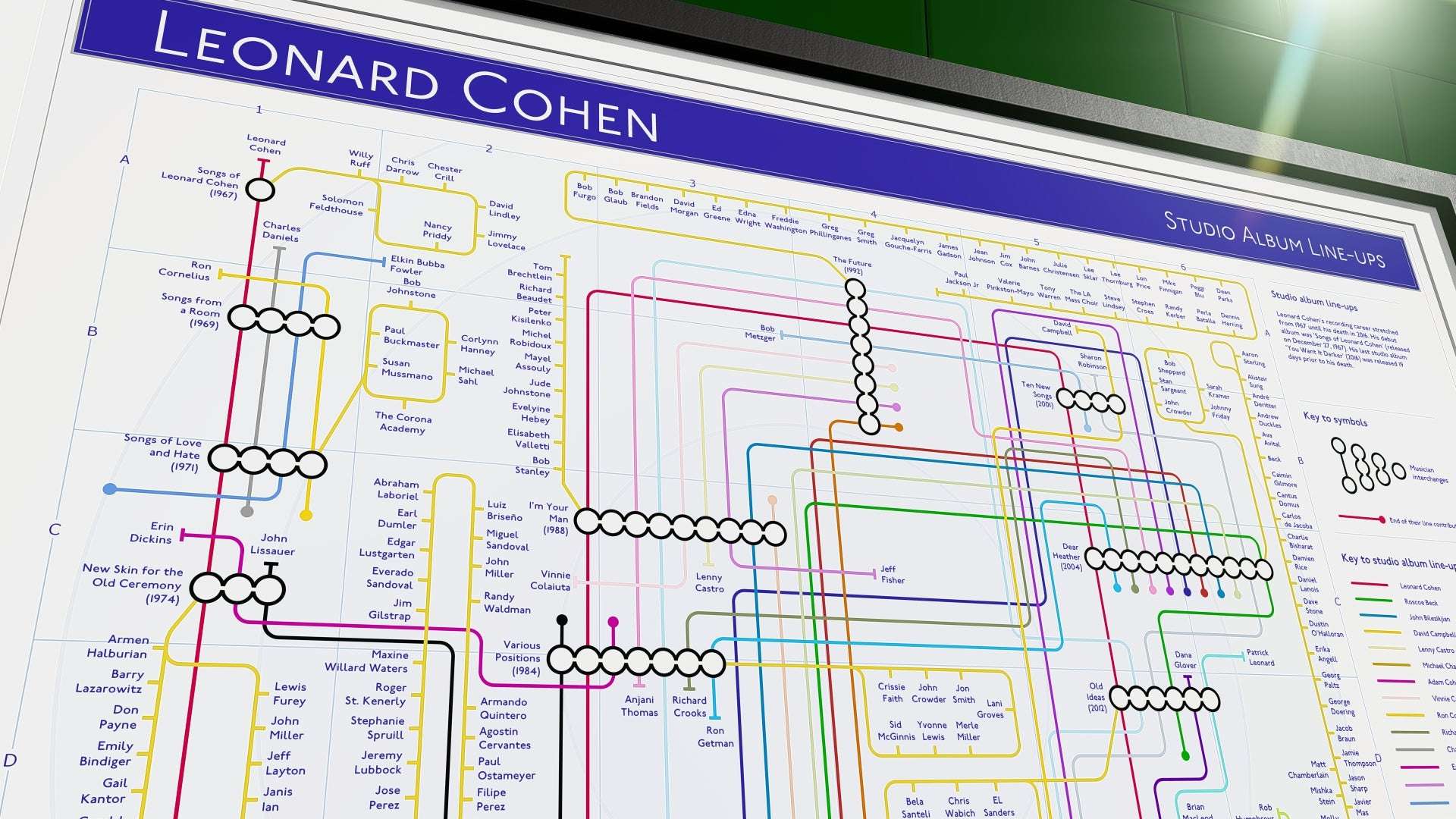
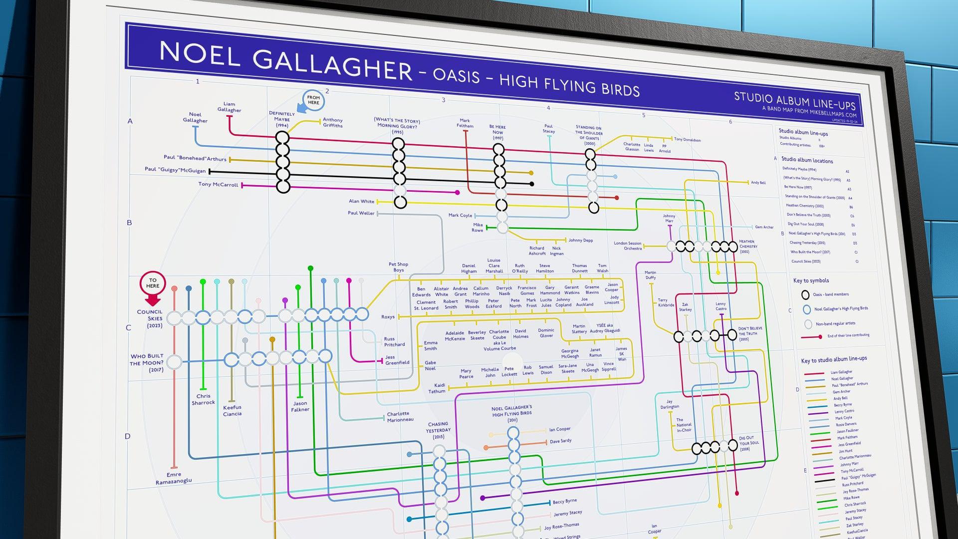
How The Music Maps Work
Albums = Stations – Each studio album is mapped as a stop on the line.
Musicians = Routes – Core members, session players & guest artists weave through albums they contributed to.
Clear Connections – Track lineup changes, collaborations & side projects effortlessly.
Why Music Fans Love These Maps
✔ A Complete Picture – Understand how a band’s sound evolved over time.
✔ Discover Hidden Links – Spot unexpected collaborations and guest appearances.
✔ Perfect for Collectors – Whether you love vinyl, streaming, or band history, these maps offer a fresh perspective.
✔ Art That Tells a Story – More than just info—these stunning prints make a great display piece.
Trace Every Album, Every Artist, Every Collaboration in one place—these maps bring music history to life!
MOVIE MAPS: Plot lines pulled apart
How The Plot Line Maps Work
Characters = Lines – Each main character follows their journey across the film.
Scenes = Stations – Every pivotal moment is mapped, showing how the story unfolds.
Clear Connections – Track relationships, intersecting storylines & hidden details at a glance.
Why Film Fans Love These Maps
✔ Follow the Entire Story – See how characters cross paths from start to finish.
✔ Spot Hidden Details – Discover new insights and narrative twists.
✔ A Must-Have for Film Buffs – A unique way to revisit and analyze classic movies.
✔ Designed for Display – More than just a chart—these stunning art prints bring cinema to life.
Explore your favorite films in a whole new way—where every twist, turn & connection is mapped out!
OTHER MAPS: History & truth reviewed
How The Political Lies Maps Work
Key Events = Stations – Major promises, betrayals & turning points mapped in sequence.
Politicians & Parties = Lines – See how figures rise, fall, and intersect across history.
Exposing the Patterns – Compare rhetoric to reality, spotting repeated tactics & broken promises.
Why These Maps Matter
✔ Follow the Patterns – See how narratives shift & history repeats itself.
✔ Untangle the Web – Track alliances, scandals & major policy shifts at a glance.
✔ A New Perspective – Connect the dots between key figures & pivotal moments.
✔ Designed to Inform & Challenge – A clear, visual way to explore political history beyond the spin.
Cut through the noise & see politics as it really unfolds—mapped out with clarity!
MIKE'S MAPS OF POLITICAL LIES
-
BORIS JOHNSON - FIRST 1,000 DAYS
Regular price From £12.00Regular priceUnit price per -
BORIS JOHNSON LIES – A Political Tube Map of Deception
Regular price From £12.00Regular priceUnit price per -
BREXIT 'BENEFITS'
Regular price From £12.00Regular priceUnit price per


SELECTING THE SUBJECT: From Music Icons to Cultural Narratives
The process begins with selecting a subject that resonates both culturally and personally. I focus on subjects with deep historical or cultural significance. For my music maps, I choose artists with extensive discographies and influential contributions to the music industry.
These are usually icons whose work has shaped genres and inspired legions of fans. Sometimes, the inspiration comes directly from fans or even family members of the artists, adding an extra layer of personal connection to the project.
When it comes to film plots, I look for narratives that have a lasting impact—stories that have captivated audiences, challenged conventions, or introduced innovative storytelling techniques.
Similarly, for political maps, I concentrate on key historical events, alliances, and moments of significant change.
The subjects I select are those that lend themselves well to visual representation, allowing me to weave together data points into a coherent and engaging story.
THE RESEARCH PROCESS: Gathering and Organizing Data
Research is the cornerstone of every map I create. For music maps, my first step is compiling a complete list of the artist’s studio albums. I dive into the credits of each album, meticulously identifying every musician involved. This phase often requires consulting multiple sources and cross-referencing to ensure that every piece of data is accurate. The level of detail is crucial—each musician, each album release, and each collaboration represents a thread in the broader narrative of an artist's career.
For film maps, the process involves deconstructing the plot into its fundamental components. I break down the narrative into key plot points, character arcs, and moments of intersection. Every character’s journey is traced as a distinct line, with their relationships and interactions mapped out to create a visual storyline. This methodical breakdown is essential, especially for films with non-linear storytelling or multiple subplots, as it helps maintain clarity and coherence in the final design.
Political maps require a different approach altogether. I track the evolution of political events, major alliances, and shifts in power. This involves a thorough review of historical data, news archives, and sometimes academic texts to capture the complexity of political narratives. Organizing this data is a challenge in itself, as political events often involve multiple overlapping timelines and interconnected events. However, by structuring the data logically, I can create a map that provides an insightful visual representation of even the most intricate political stories.
THE DESIGN PHASE: Precision WITHOUT AI Software
Once the research is complete, the next step is to transform raw data into art. I use 2D CAD software to plot the map—a method that might seem unconventional in the realm of art but is essential for achieving the precision required in my work. Each map is built on a foundation of exact measurements and carefully drawn elements.
In my maps, every line represents a connection—be it between musicians who collaborated on an album, pivotal plot points in a film, or major political events that shaped history. Intersections mark significant milestones such as album releases, key character interactions, or turning points in political shifts. This meticulous attention to detail ensures that every element of the map is not only accurate but also visually engaging.
The use of CAD software allows me to maintain a balance between artistic expression and data accuracy. While the software is typically used in engineering or architecture, its precision is exactly what is needed to bring my maps to life. The final layout is designed to be both aesthetically pleasing and clear, ensuring that anyone who views the map can easily follow the story it tells.
MAPPING FILM PLOTS: Translating Stories into Visual Form
One of the most challenging yet rewarding aspects of my work is mapping film plots. Films often have complex narratives with multiple characters and intricate storylines. My approach is to translate these stories into visual formats that capture the essence of the narrative without oversimplifying it.
For each film, I start by identifying the main characters and their individual storylines. Each character is assigned a distinct line, and significant plot points—such as key decisions, conflicts, or turning points—are marked as intersections. This visual method ensures that the narrative remains clear, even for films that feature non-linear storytelling or multiple intertwining plots.
The challenge lies in balancing simplicity with depth. While I aim to keep the design uncluttered, I also want to include enough detail to convey the full narrative. This means carefully selecting which elements to emphasize and which to simplify, a process that requires both analytical precision and creative intuition.
FINAL OUTPUTS: High-Quality Art Prints for Every Space
After all the data is gathered, the design is meticulously plotted, and every detail is fine-tuned, the final step is to produce a high-quality art print. I offer these maps in various sizes, from compact A5 cards that are perfect for a personal collection to large A1 prints that make a bold statement in any space.
Each print is produced with the utmost attention to detail. The clarity of the lines, the precision of the intersections, and the overall layout are all crafted to ensure that the map is not only informative but also a visually striking piece of art. My maps are designed to be more than just decorative items—they are conversation starters, tools for education, and a celebration of the intricate relationships that define our cultural, musical, and political landscapes.
RECENT BLOG POSTS
View all-

New Order Albums vs Foo Fighters Albums: From J...
Mike BellNew Order vs Foo Fighters - a brace of unique discographies; New Order has 10 albums, and Foo Fighters has 11. Lineup changes impacted their sound. Foo Fighters sold over...
New Order Albums vs Foo Fighters Albums: From J...
Mike BellNew Order vs Foo Fighters - a brace of unique discographies; New Order has 10 albums, and Foo Fighters has 11. Lineup changes impacted their sound. Foo Fighters sold over...
-

Morrissey vs Marr - What Difference Does It Make?
Mike BellAfter The Smiths broke up, Morrissey vs Marr ensued - and both took very different paths. Morrissey’s solo career was commercially successful, with UK number-one albums like Viva Hate (1988) and hit singles...
Morrissey vs Marr - What Difference Does It Make?
Mike BellAfter The Smiths broke up, Morrissey vs Marr ensued - and both took very different paths. Morrissey’s solo career was commercially successful, with UK number-one albums like Viva Hate (1988) and hit singles...
-

The Smiths Albums: Imagining the Ones They Neve...
Mike BellThe Smiths left a lasting impact with their four studio albums before disbanding in 1987. But what if they had stayed together? In this blog post, I explore what the...
The Smiths Albums: Imagining the Ones They Neve...
Mike BellThe Smiths left a lasting impact with their four studio albums before disbanding in 1987. But what if they had stayed together? In this blog post, I explore what the...
-

The Cure vs Echo and the Bunnymen - A Comparison
Mike BellThe Cure vs Echo and the Bunnymen is a considered review of two very infuential groups over a large chunk of the history of modern music. Echo & the Bunnymen...
The Cure vs Echo and the Bunnymen - A Comparison
Mike BellThe Cure vs Echo and the Bunnymen is a considered review of two very infuential groups over a large chunk of the history of modern music. Echo & the Bunnymen...


MAKING THE MAPS
I work from my studio in East Sussex, where I am constantly creating music maps and plot line maps that represent the musical journeys of bands and solo artists, film narratives, and political events.
Each map results from meticulous research and careful planning, combining precision with creativity to produce something visually striking and data-driven.

Selecting the Subject: From Music Icons to Cultural Narratives
When thinking about making music maps I choose artists with extensive discographies and significant influence on music and culture for my music maps. Often, fans or family members of the artists request these maps, adding a personal connection layer. I focus on plots and historical moments for films and political events that lend themselves well to visual representation.

Making Music Maps & More: Gathering and Organizing Data
Research is a key part of the process. I begin by compiling a list of the artist’s studio albums for music maps. I then researched the credits for each album to identify the musicians involved. This often requires sifting through multiple sources and cross-referencing to ensure accuracy. Once I have the necessary data, I begin correlating it to lay the groundwork for the map.
For films, the process involves breaking down the plot into key points, characters, and their relationships. For political maps, I track major events, alliances, and shifts in power, organizing the data to create a logical and visually coherent design.
The Design Phase: Precision and CAD Software
Once the research is complete, I begin plotting the map using 2D CAD software. This approach is uncommon in art but allows for the precision required in my maps. Each line represents a connection between musicians, plot points, or political events—while intersections mark significant moments like album releases, character interactions, or key political shifts. Every element is individually drawn to ensure accuracy, and the layout is designed for both visual appeal and clarity.

Mapping Film Plots: Translating Stories into Visual Form
When mapping movie plots, I focus on translating the story structure into a visual format. Characters often have their own “lines,” with major plot points or twists becoming intersections. This method ensures the narrative remains clear, even when dealing with complex or non-linear plots. The challenge lies in maintaining simplicity without losing the key elements of the story.

Political Maps: Charting the Complexity of Power Dynamics
I track the evolution of political events, figures, and alliances for political maps. This involves organizing the often complex and shifting data into an easy-to-follow format. The maps allow a visual understanding of political movements, highlighting key turning points and connections between influential figures or events.

Final Output: High-Quality Art Prints
After completing the design, I offer the maps as high-quality art prints in a range of sizes. Each print is created with attention to detail, ensuring that it meets the highest standards of quality.
Great feedback from customers keeps me motivated, along with knowledgeable input!
About Me: From Event Designer to Data Visualization Specialist
Hi, I’m Mike Bell, a UK-based show and event designer. I started creating these tube-style maps during the lockdown when my work in event design was temporarily put on hold. The first map combined my past experience in live music with a growing interest in data visualization. Since then, I’ve continued to create maps alongside my work in event design, and the two disciplines now form the core of my creative output.
PRINT SIZE GUIDES
| Paper Size | Dimensions (mm) | Dimensions (inches) |
|---|---|---|
| A4 | 210 x 297 | 8.27 x 11.69 |
| A3 | 297 x 420 | 11.69 x 16.54 |
| A2 | 420 x 594 | 16.54 x 23.39 |

FEEDBACK - ARTISTS/ORGS
Some of the musician feedback and a few other related organisations have engaged with my music maps.
"IT IS TRULY AMAZING” THE BRUCE SPRINGSTEEN ARCHIVE
"AWESOME!!" WARREN ELLIS
".. IT'S A BRILLIANT IDEA.. REALLY LIKE WHAT YOU'VE DONE, MIKE.." BILLY BRAGG
"BRILLIANT SERIES.." SIMON ROGERS
"YOUR WORK IS VERY COOL AND SMART. I'D LOVE TO HAVE A COPY OF THE PRINCE MAP, ONCE YOU’VE COMPLETED IT." SUSAN ROGERS, PRODUCER
"THE PERFECT GIFT FOR PEOPLE WHO LOVE TO SHOW OFF THEIR MUSIC KNOWLEDGE" RESIDENT MUSIC, BRIGHTON